Design System
Revamped a loose Figma guide into a token-bound library — then taught it to grow itself with AI agents.
When I joined, “the design system” was a rough Figma style guide — shared elements pulled from the live app, but no real components and no tokens. With our other designer I co-led the rebuild into a true library: real components with full property sets, semantic tokens, and parity across mobile and web. To keep it growing without more hands, I built a pair of AI agents that create and review new components against our tokens and HIG/Material rules.
A style guide,
not a system
The starting point was a Figma file used as a reference — consistent-looking elements pulled from the live app, but nothing was a real component. Every new screen meant redrawing or copy-pasting from the guide; values drifted between the two of us; and there was no way to ship dark mode or retheme without editing every file by hand. Spanning mobile and web with two designers, that simply didn’t scale.
From style guide
to autonomous system
Four phases, each one removing more friction from the design workflow.
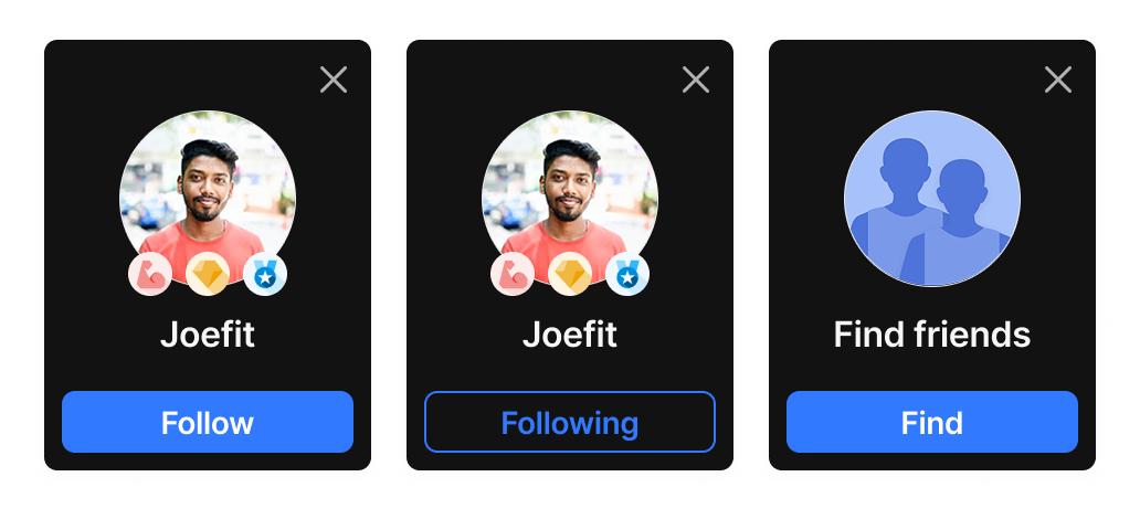
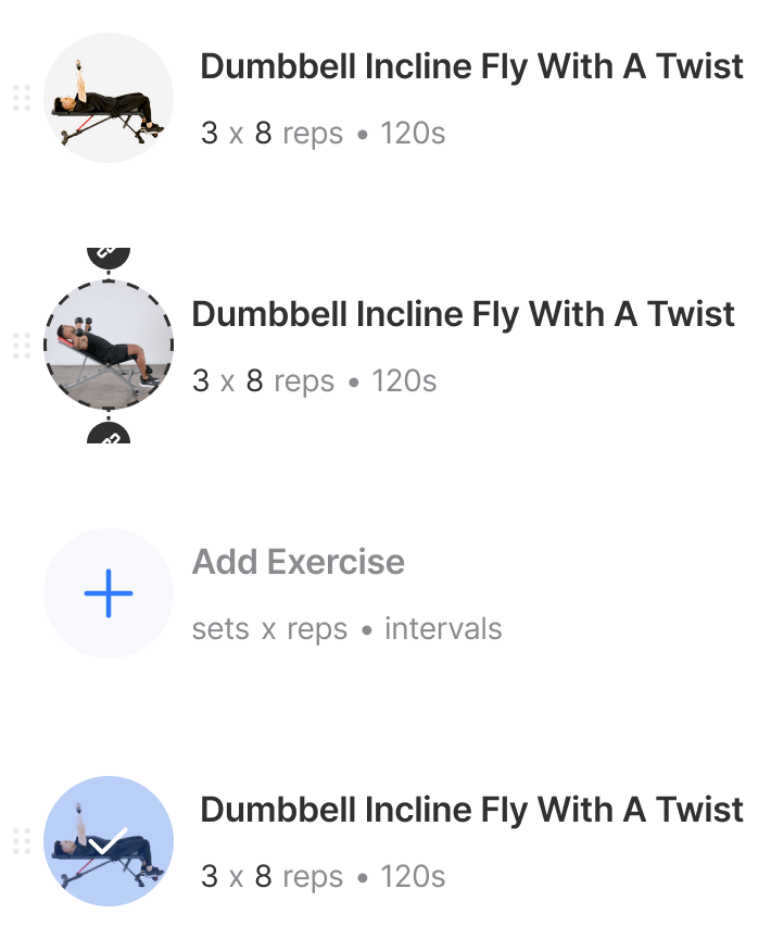
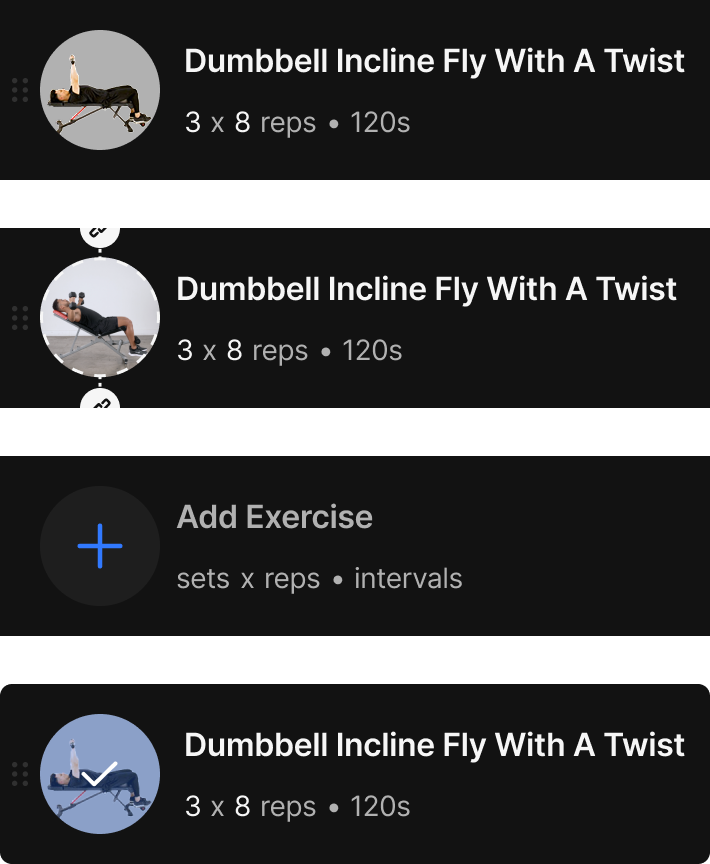
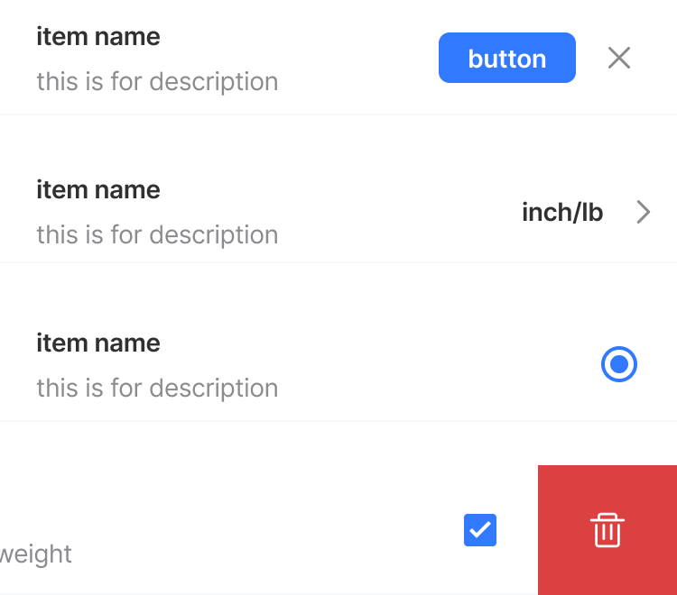
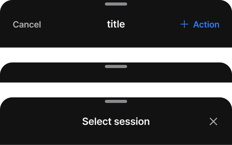
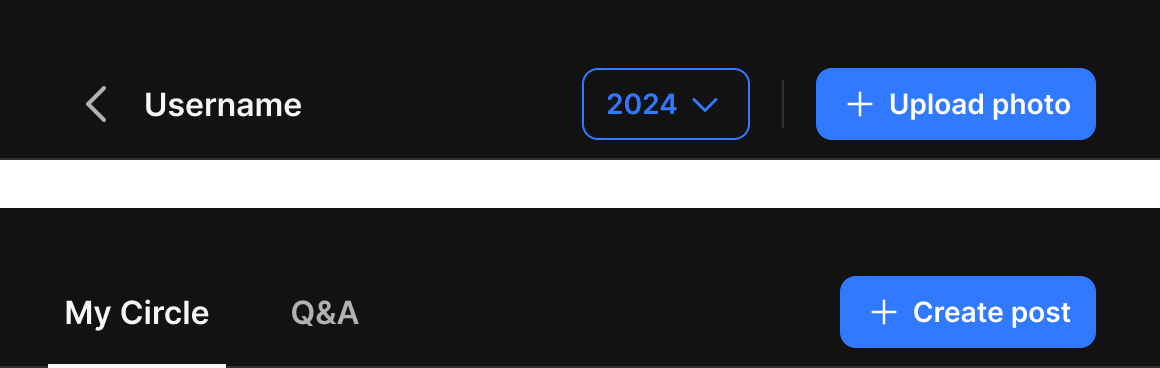
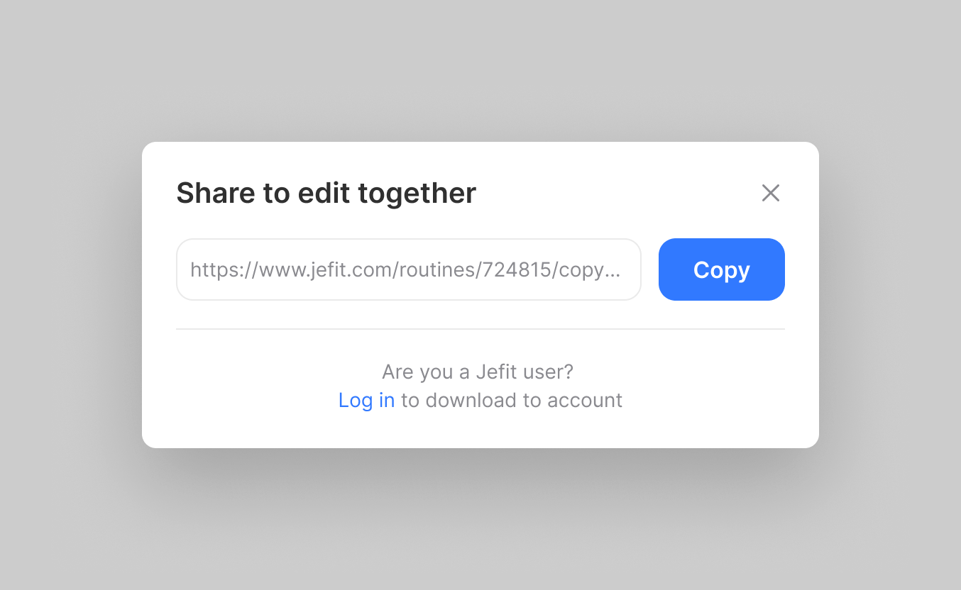
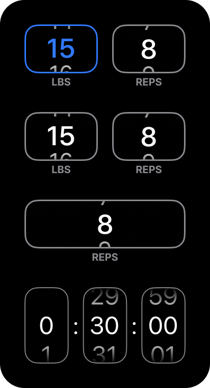
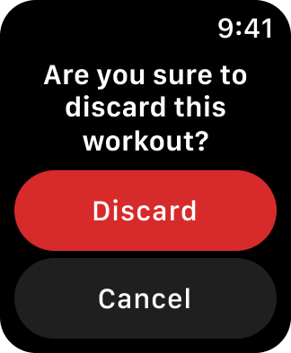
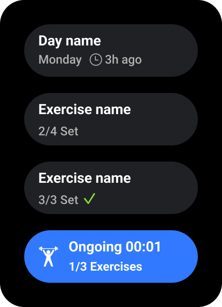
builder.md + evaluator.md — to automate creating and reviewing components.Under NDA — the Mobile & Web assets that follow show only a small slice of the system; the full component set and production details can’t be shared publicly.
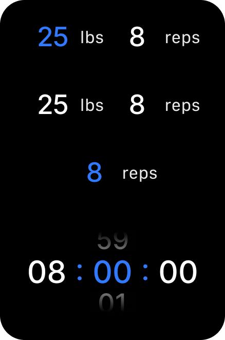
Mobile foundations
& components
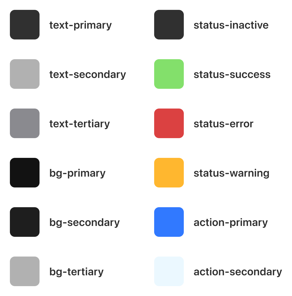
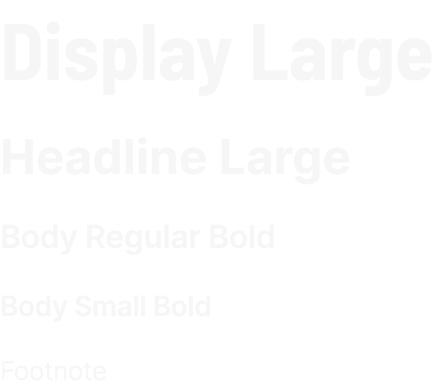
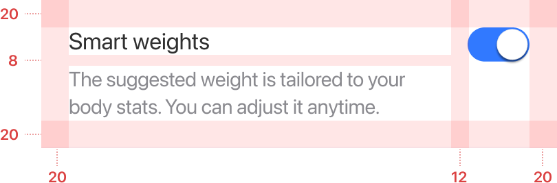
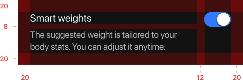
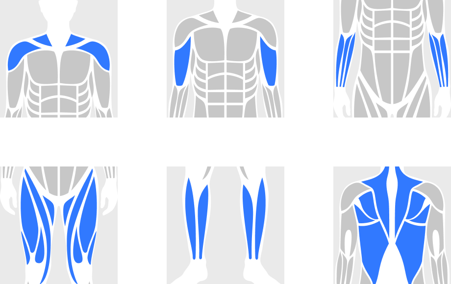
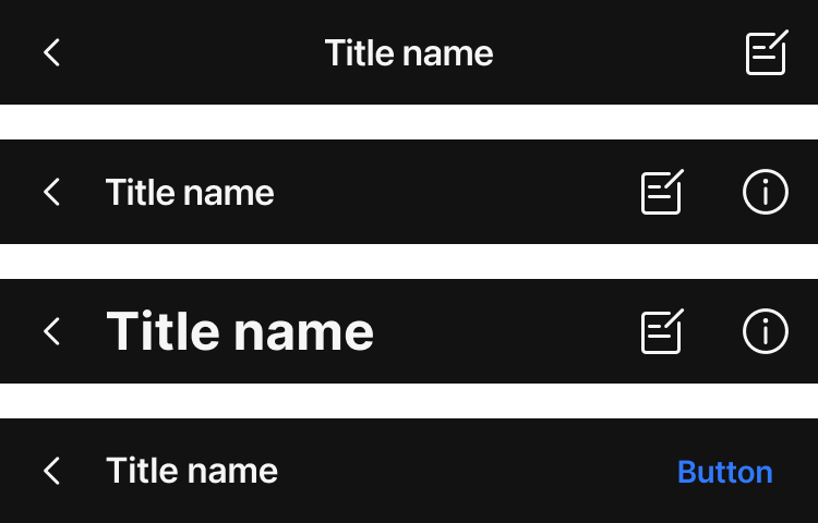
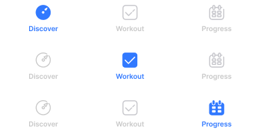
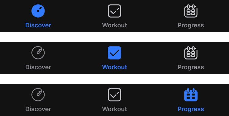
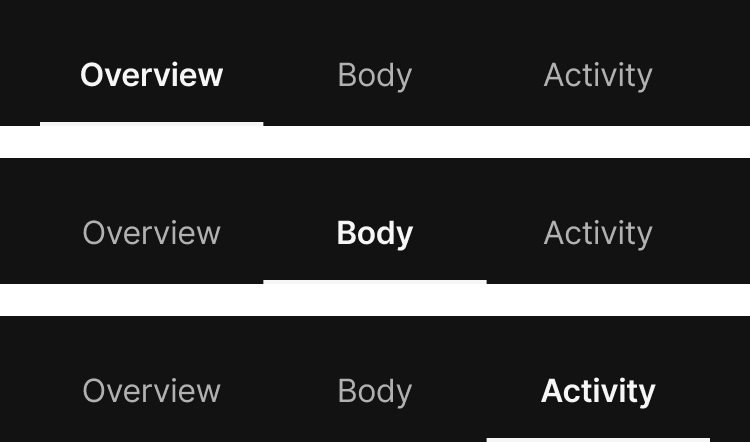
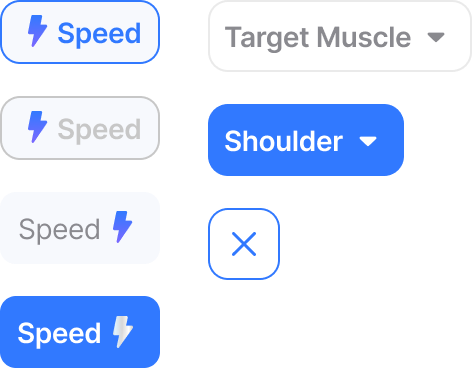
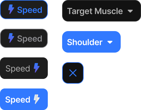
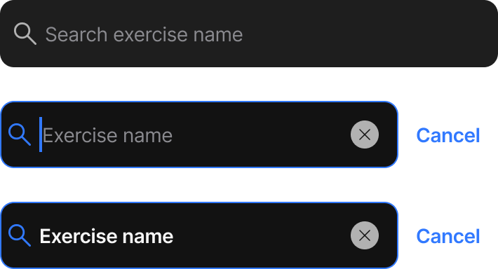
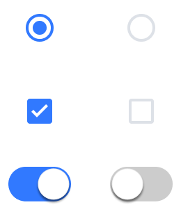
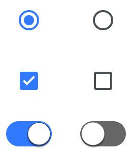
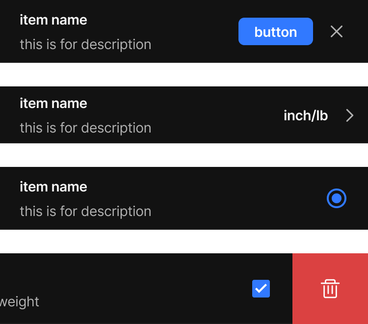
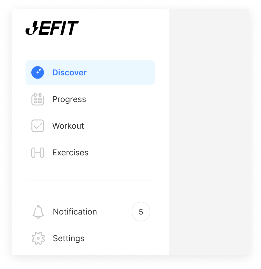
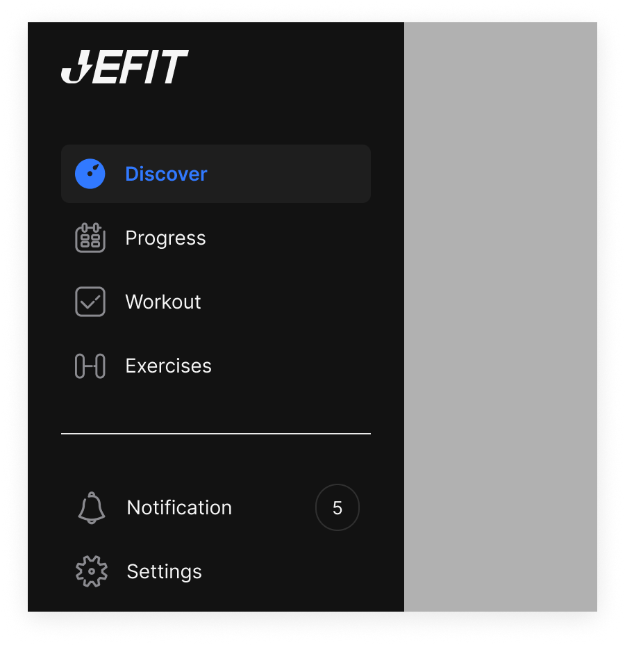
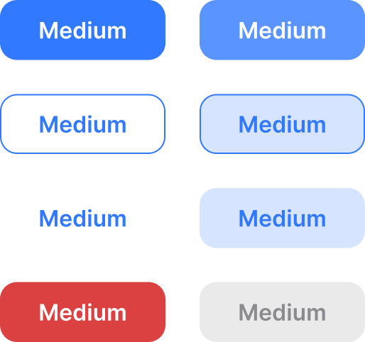
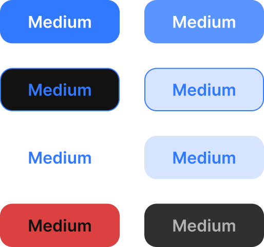
Implemented the iOS & Android library from the ground up — a type ramp, a spacing scale, and a set of componentized primitives. Every fill, stroke, and dimension binds to a semantic token, so light/dark themes and platform variants flow through the whole library from a single source.

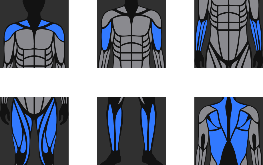
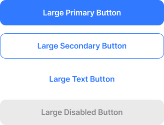
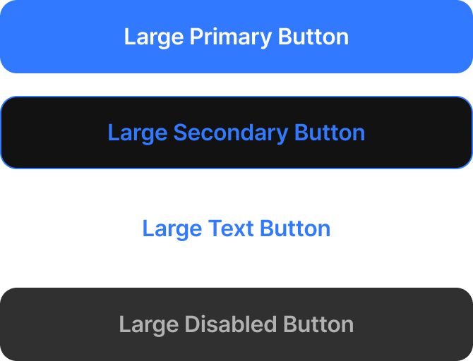
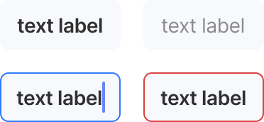
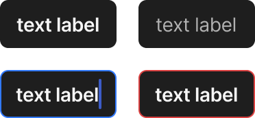


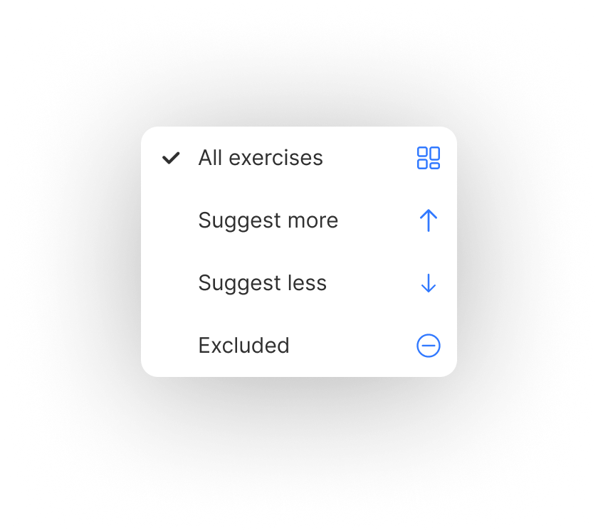
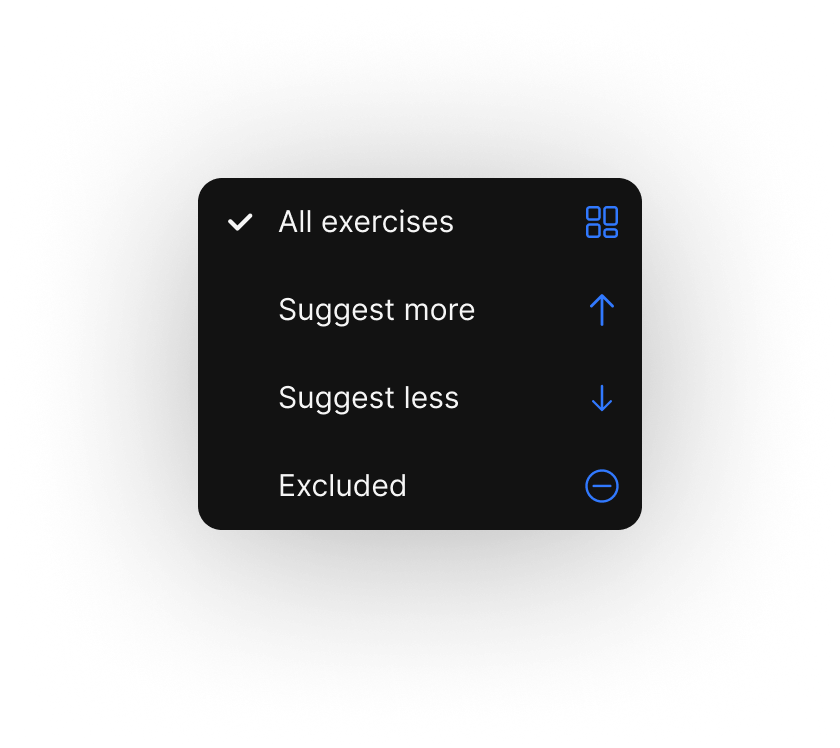
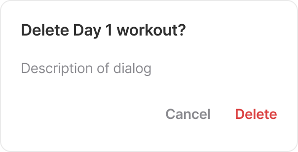
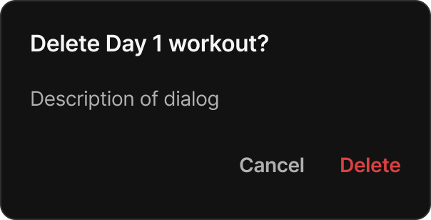
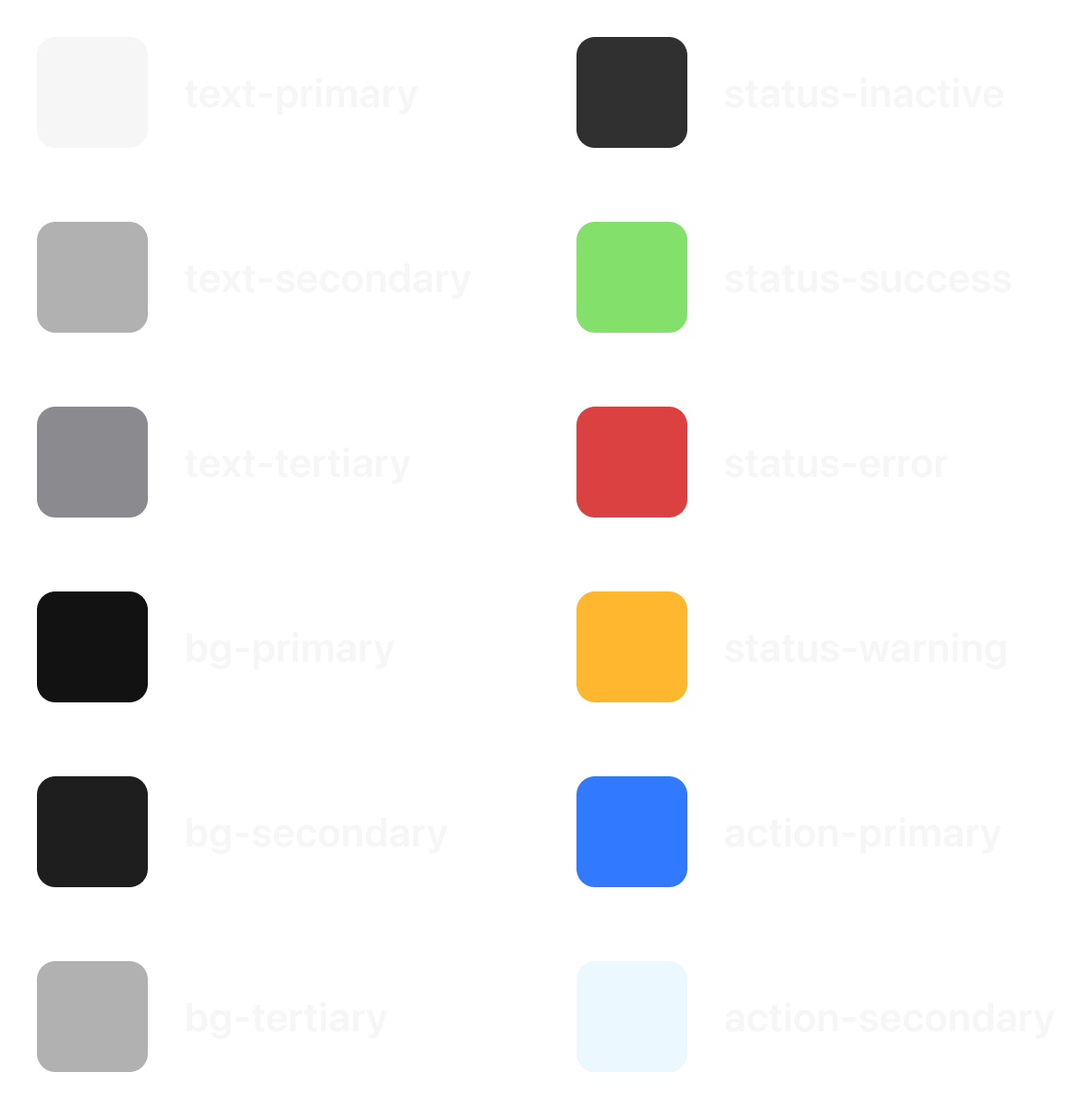
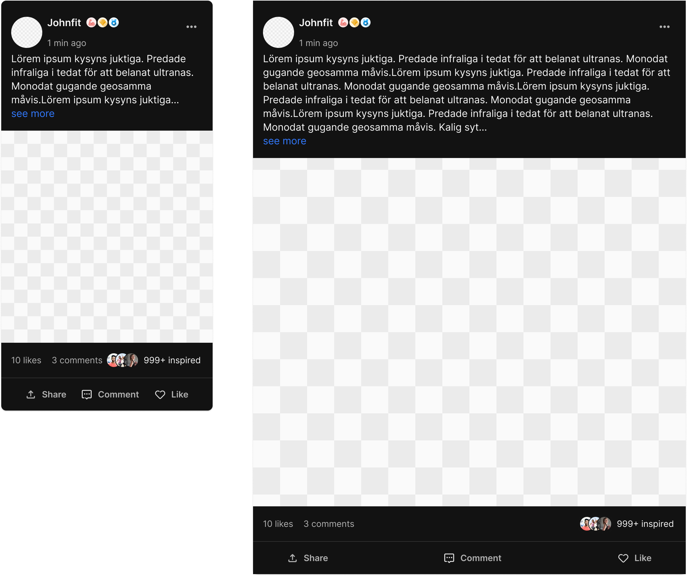
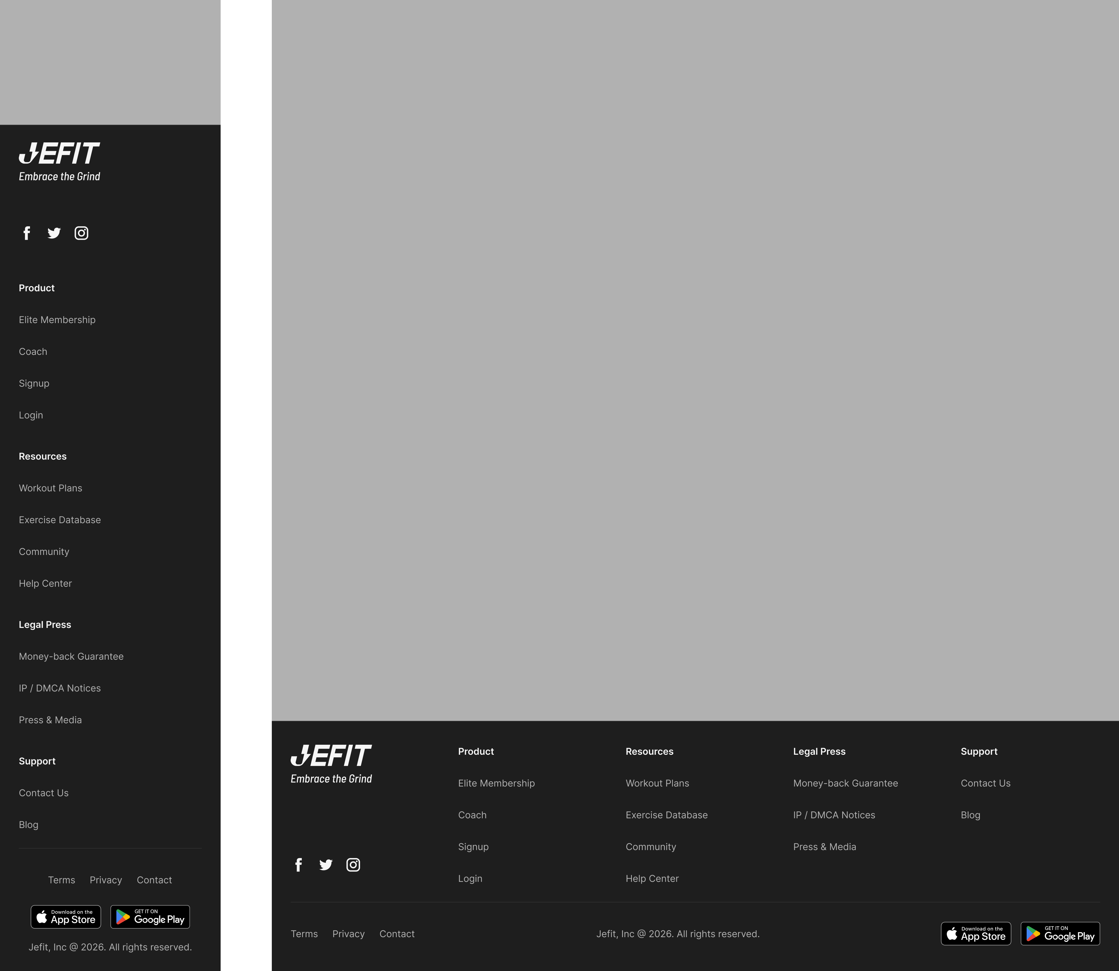
One token core,
the whole dark system
Every primitive above binds to the same semantic tokens — so the entire library rethemes to dark from a single source, no redraws. The mobile set, rendered on its dark surface, before the same core extends to web.
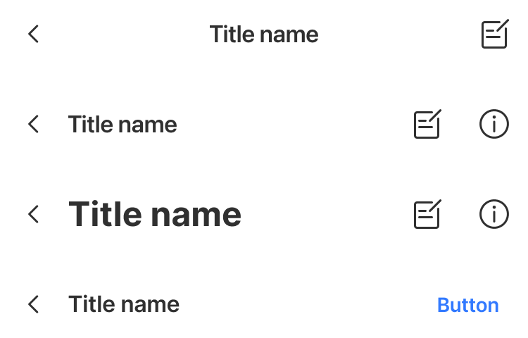
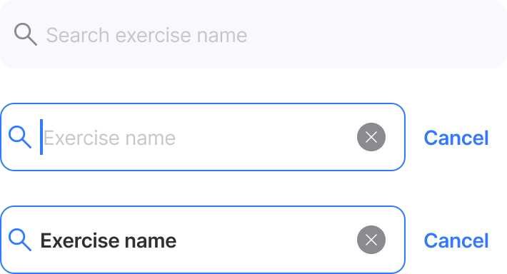
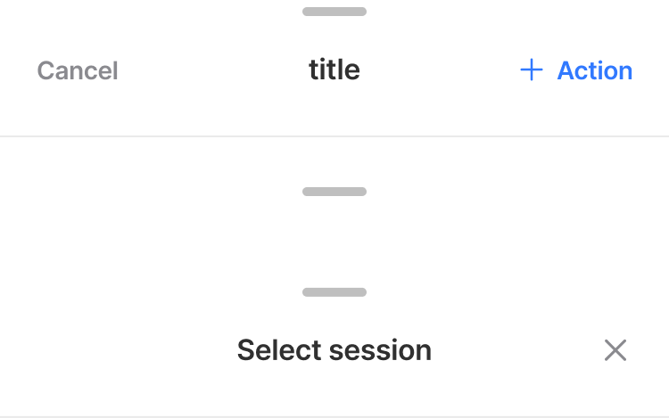
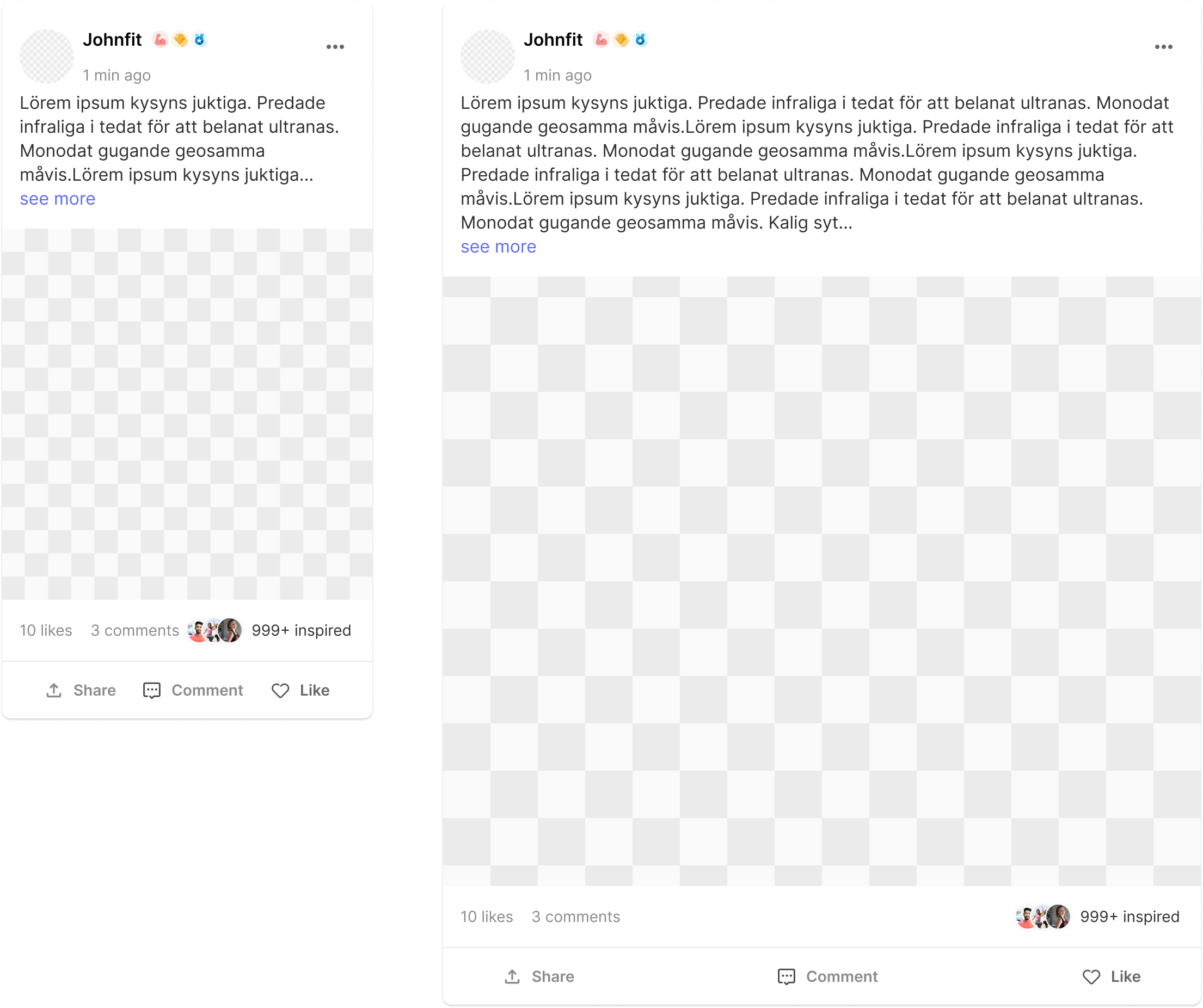
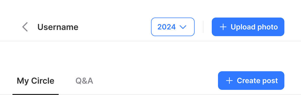
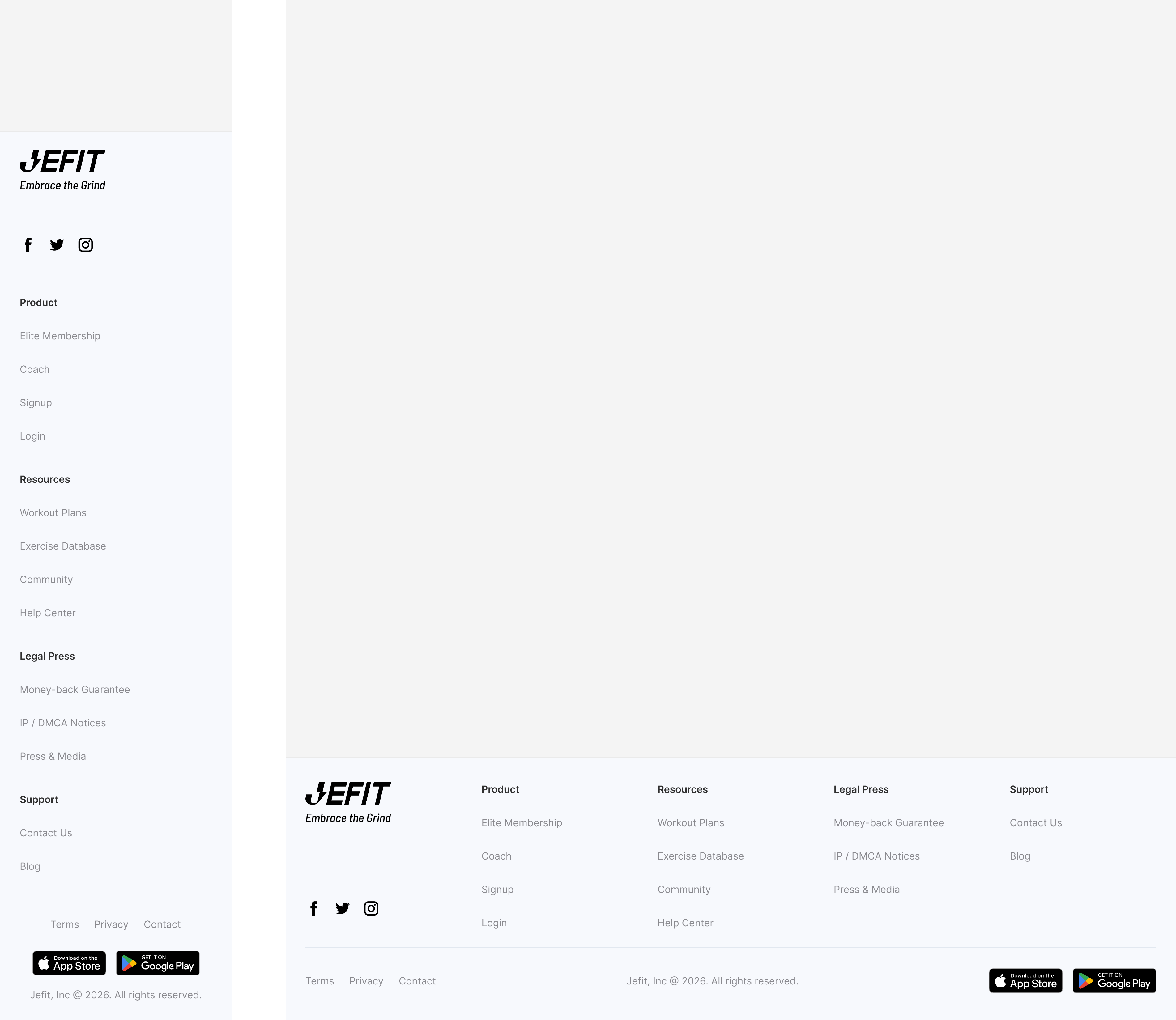
Web parity —
same tokens, wider canvas
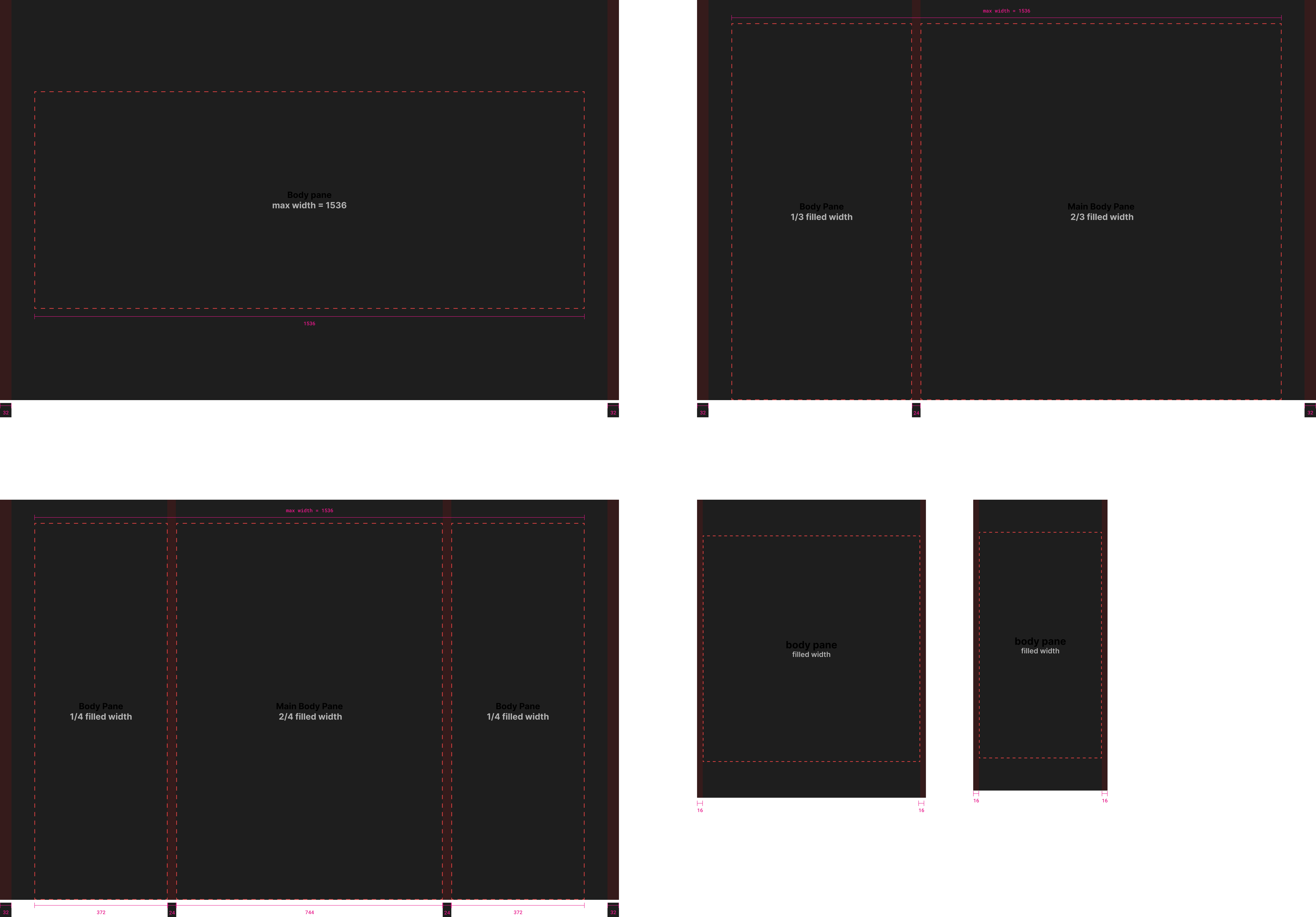
Extended the system to web with a shared token core. The type scale opens up for desktop reading, layout moves to a wider column grid, and the component set adds the web-native primitives (sidebars, data tables, toolbars) on top of the mobile foundations.


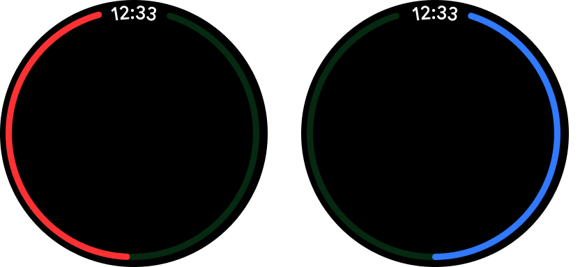
Native to the wrist —
watchOS & Wear OS
The newest surface for the system, on both wrists. Rather than shrink the phone UI onto a 1-inch screen, I built the watch set on each platform’s native foundations — Apple’s watchOS and Android’s Wear OS title and card patterns — then layered our own brand components on top. It reads as native to each platform while staying recognisably ours, and still binds to the same token core as mobile and web.

Automate the build,
gate the publish
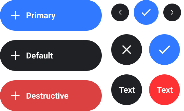
A 2-designer team can’t scale linearly with the product. So I built our component-creator skill as two agents — builder.md and evaluator.md — that automate the repetitive half of design-system work. Both follow one rule: every built component is a 1-to-1 mirror of its source frame — bind tokens, expose every property, never invent or silently “fix.”
What changed
The biggest pain for a 2-person team was time. Componentizing the library bought back hours and the agents bought back days — but the bigger payoff came later, when the same token core became the launchpad for a brand refresh.
to the rebrand
What I Learned
Adapt before you create. A 2-person team can’t out-work a growing product, so most of my calls optimized for leverage over short-term speed. The builder treats “make a new component” as a last resort — it adapts an existing one by default. Reuse is what keeps a library coherent; every net-new primitive is a future maintenance cost.
Fidelity over cleverness — and a gate to enforce it. The hard call was making the AI boring — a 1-to-1 mirror of the source frame, never inventing or silently “fixing,” because a design system that quietly improves things is a system you can’t trust. So builder and evaluator are split on purpose: an independent gate — one that can recommend but never publish — catches the drift that self-review rationalizes away.
Tokens first, even when slower. Binding every value to a semantic token cost time up front and felt like overkill at a dozen components. It’s exactly what later turned a full rebrand into a config change instead of a rebuild.
The real test is organizational, not technical. The agents are the newest piece — whether a teammate who didn’t build them can drive them, and whether the evaluator’s bar holds as components get more complex. Designing for that hand-off is where I’d put the next round of work.