Consumption
Analytics
HPE GreenLake’s Consumption Analytics — a modular chart system for tracking and forecasting enterprise cloud spend.
Project at a Glance
In summer 2023 I joined the HPE GreenLake Cloud Platform team as a UX Design Intern, working on Consumption Analytics — the product enterprise teams use to track and forecast their cloud spend. My work centered on the dashboard’s customization features. The ask was open‑ended: users had said they wanted to “customize their dashboards,” and no one had defined what that should mean. Over 14 weeks I went from competitive research to a high‑fidelity, modular chart system — narrowing a sprawling wish‑list through three rounds of UX critique, working alongside a UI developer, a product manager, a UX researcher, and a fellow designer.
What is
Consumption Analytics?
HPE GreenLake Consumption Analytics helps organizations monitor and manage how they use IT resources and services — surfacing usage patterns, resource allocation, and cost efficiency. Picture the user: a system administrator at a medium‑sized IT company who wants to optimize resource usage, cut costs, and find the soft spots across their infrastructure. The product already existed and had traction — my job wasn’t to invent it, but to make it bend to how each admin actually reads their data.
Before I joined, the CA team had run rounds of usability testing. One theme kept surfacing: users wanted to make the dashboard theirs — four asks, in their own words:
I want to move my charts around the dashboard.
Let me blow a chart up so I can dig into the detail.
I should be able to add and remove charts myself.
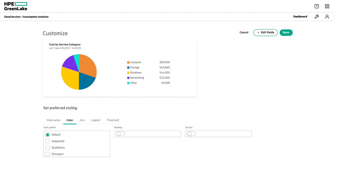
Can I change the colors and styling to my own preference?

14 weeks,
five phases
Research up front, three iteration rounds in the middle — each gated by a UX critique — then a final demo and a handoff to usability testing.
An NDA internship project. Consumption Analytics is a proprietary HPE GreenLake product — the screens below are intern explorations, the data shown is illustrative, and only a slice of the work is shared here.
Learn from everyone
else first
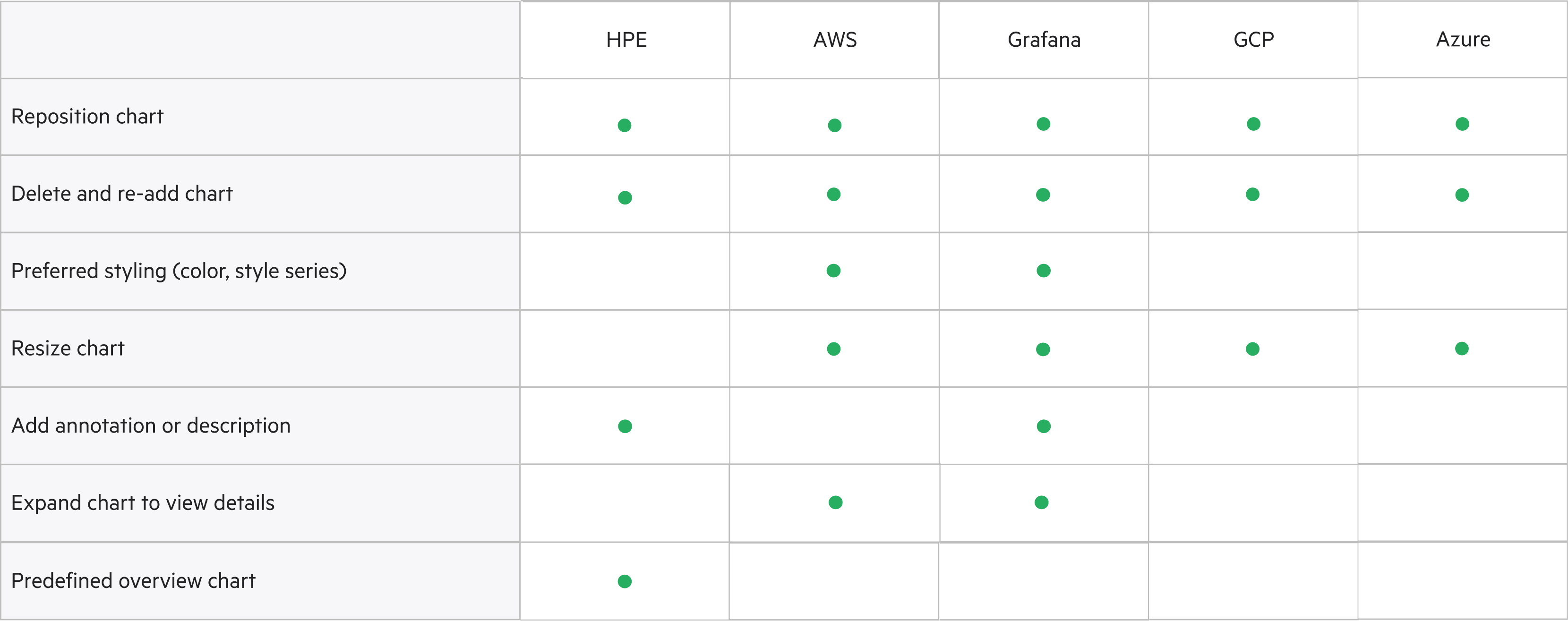
I led the research: how do competitors and HPE’s own products handle chart customization? I benchmarked five platforms — HPE, AWS, Google Cloud, Grafana, Azure — and audited HPE’s own dashboards against earlier usability findings. The takeaway: customization wasn’t one feature but a spectrum, from re‑arranging tiles to fine‑tuning a single chart’s color and line weight — and naming that spectrum is what let us scope it.
How might we give users the customization abilities to empower them with their visualizations?
Two structures,
a pile of features
With the research in hand, I opened up the solution space along three threads — how you edit the dashboard (how charts are laid out), how charts get customized, and the smaller features layered on top. The first two came down to either/or bets; the rest were capabilities to weigh. I kept the net wide on purpose — get every plausible direction on the table before critique started cutting.
Critique,
narrow, repeat
Every round was anchored by a UX critique and a stakeholder check‑in, and every round was an exercise in subtraction. We walked into the first stakeholder meeting — a product manager, developers, and researchers — with one thing painfully clear:
Too many ideas spark innovative solutions — but every one of them landed on the same dashboard at once, and the path turned into a knot that overwhelms users.
So before going further, we sat down with our managers and re‑evaluated everything — what to keep, what to cut, and the harder call underneath it all: pivot, or stay. We stayed — depth had earned more than breadth — and drew a hard line through the feature list:
- Custom & template dashboards
- Collapse / remove
- Drag‑to‑move
- Pinning
- Axis / legend / threshold controls
- Tiled design
- Resize
- Expand
- Color customization
- Style‑series customization
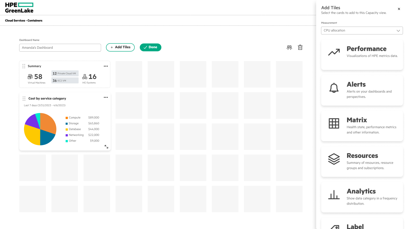
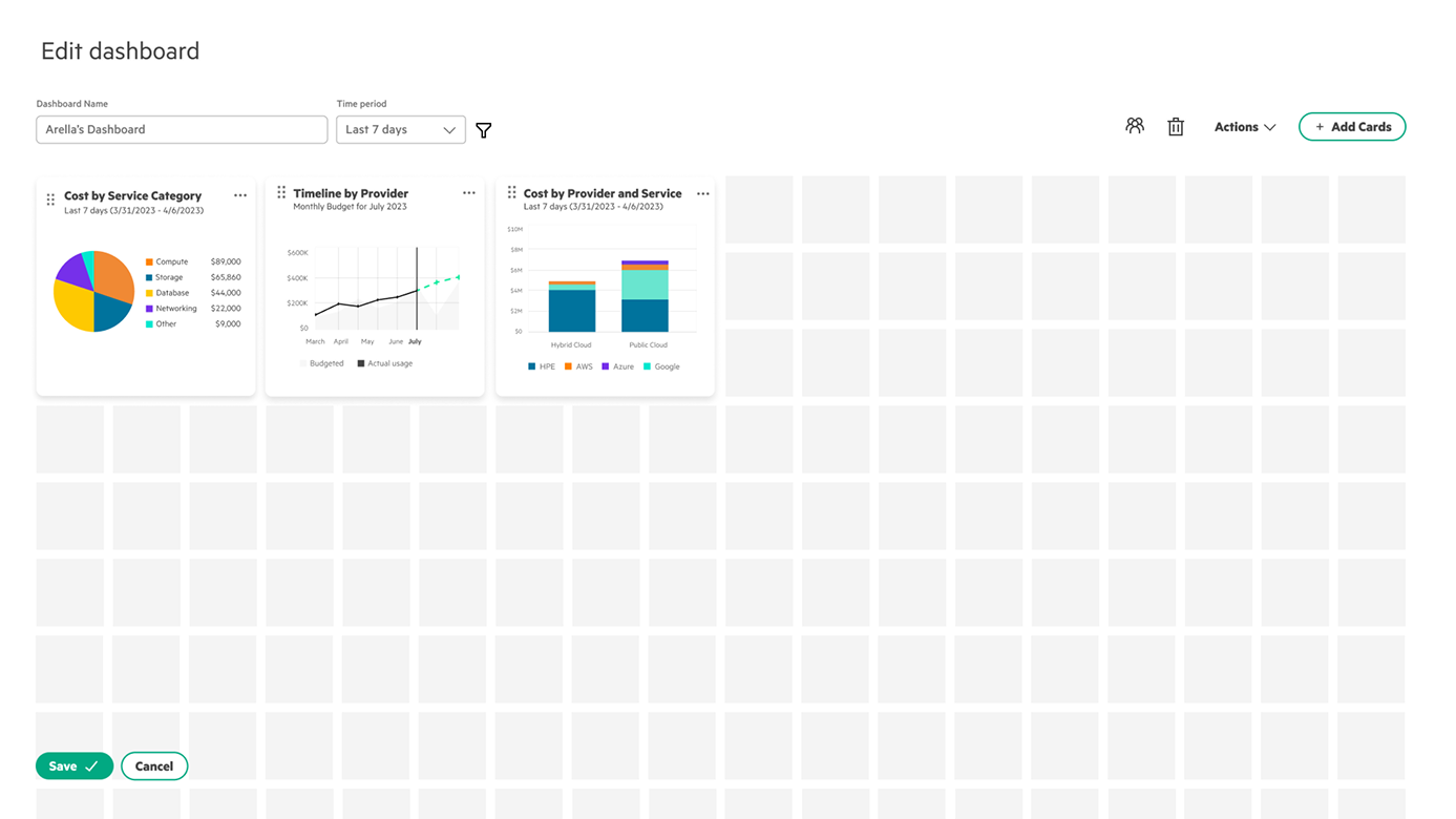
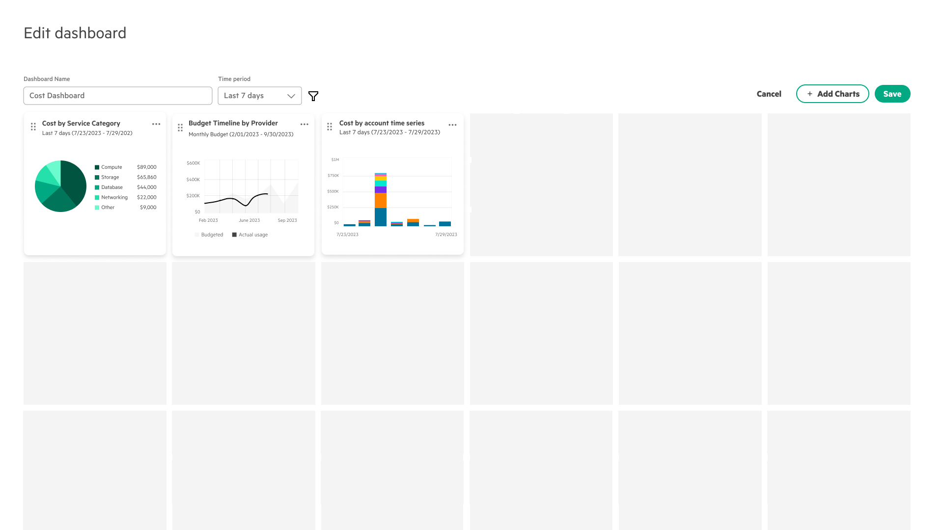
For the edit canvas I explored three directions — freeform, tiled, and a full‑screen add‑charts modal — and out of the first stakeholder meeting committed to tiled. From there it took three passes. v1: the grid stopped dead at the bottom, so users couldn’t tell they could add more cards. v2 removed the header for a focused view and ran the grid past the window edge to signal room below — but the save button could overlap the charts, and new charts dropped in at 1×1 instead of 3×3. v3 fixed the layout: bigger default grid squares, the save button moved to the top right, and share / delete‑dashboard pulled out of edit mode.
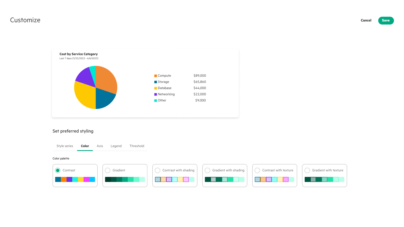
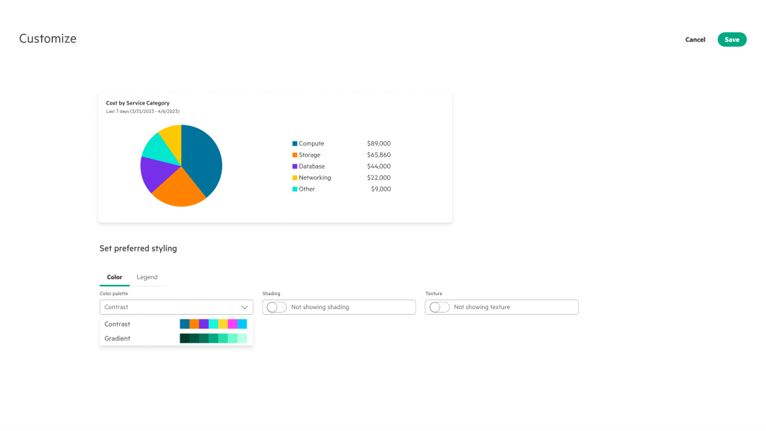
Three passes, each gated by a critique. v1’s palette names (‘qualitative’, ‘sequential’) confused people, and its headers offered too many ways to wander off mid‑task. v2 renamed them to contrast and gradient, added swatch previews, and dropped the header into a full‑screen modal. A second meeting flagged that more than four options still overwhelmed users — and that the controls should reuse one select component — so v3 folded the previews into that select and turned texture and shading into simple toggles.
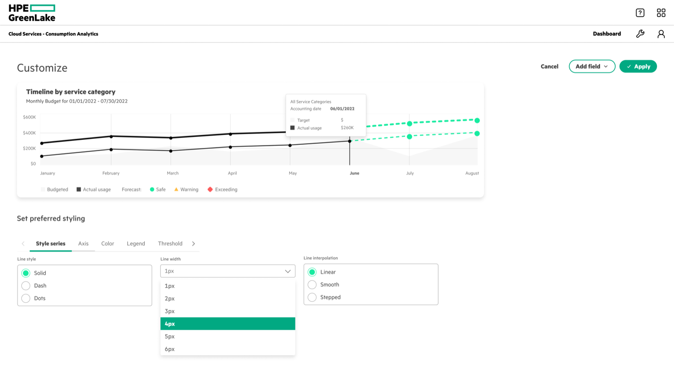
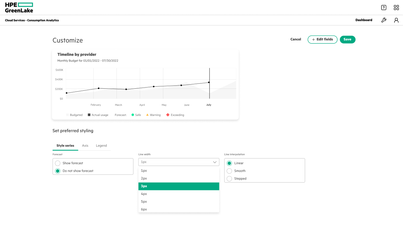
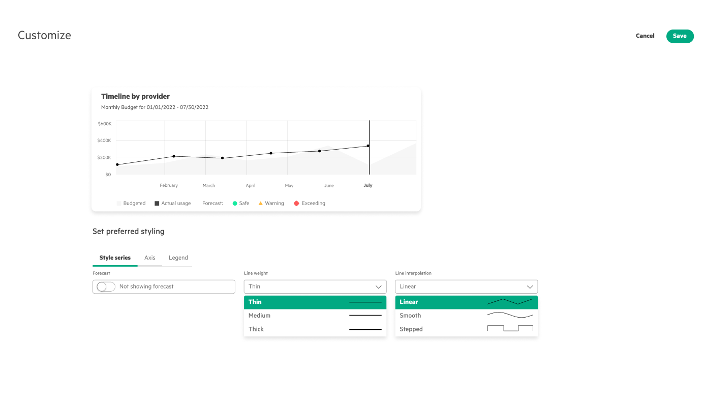
Three passes. v1 piled on options — so many that users stalled on the choice. v2 cut scope: I dropped adding multiple line charts (data‑dependent, out of scope) and the advanced axis, legend, and threshold controls. A second meeting flagged the options still lacked visual identifiers, meaning more clicking to see what each did. v3 settled it: a full‑screen modal with just enough — line weight limited to three labeled options, with visual previews inside the select.
The design it all led to.
A modular,
high‑fidelity dashboard
It all grew from one starting idea — let people customize their dashboard. Narrowing settled on five capabilities to do well: a tiled layout, resize, expand, color, and style. Here’s each one in motion — we demoed it on August 3rd.
Style customization
Tune line weight and interpolation per chart, each option with a visual preview.
Color customization
Recolor charts with plain‑language palettes — contrast vs. gradient — and live swatch previews.
Resize charts
Drag a tile larger or smaller so the charts that matter get the room they need.
Expand charts
Open any chart to full screen to read the detail that’s hard to see inside a tile.
What the summer
added up to
It was an internship, so there’s no shipped‑product KPI to point to — the win was turning an open‑ended “let users customize” into a scoped, research‑backed, demoed system. The numbers below measure that: how hard we tested the direction, and how well it held up.
Both the design‑system team and the Consumption Analytics team approved the direction, and the research team validated it in usability testing — the new zoom, restyle, and grid‑resize controls are what moved that completion number, and informed which feature the teams would build first.
The real deliverable wasn’t the feature list — it was the narrowing: a defended point of view that depth beats breadth.
What I Learned
Adhere to the design system. This was my first time working inside a real design system, and there was an enormous amount to absorb — but I saw its value firsthand: a cohesive experience across the whole platform, smoother collaboration between designers, developers, and stakeholders, and a foundation that genuinely scales.
Make strategic tradeoffs. Sitting in UX critiques and stakeholder meetings taught me to make decisions that weigh developer workload, business requirements, and customer preferences all at once — not just what looks best in Figma. Almost every round, the right call was to constrain the options and add a visual cue rather than ship more.
Be bold and agile. Be bold in asking questions and chasing wild explorations to the point of failure — then agile in adapting to the feedback and iterating fast. The strongest move all summer was cutting: a few customization features done well beat a dozen done halfway.
What I’d test next. The directions held up in critique; the next proof is whether they hold up in production. I’d pressure‑test the customization system with real admins on their own data — the part an intern timeline never quite reaches — in the hands of the people who live in this dashboard every day.